
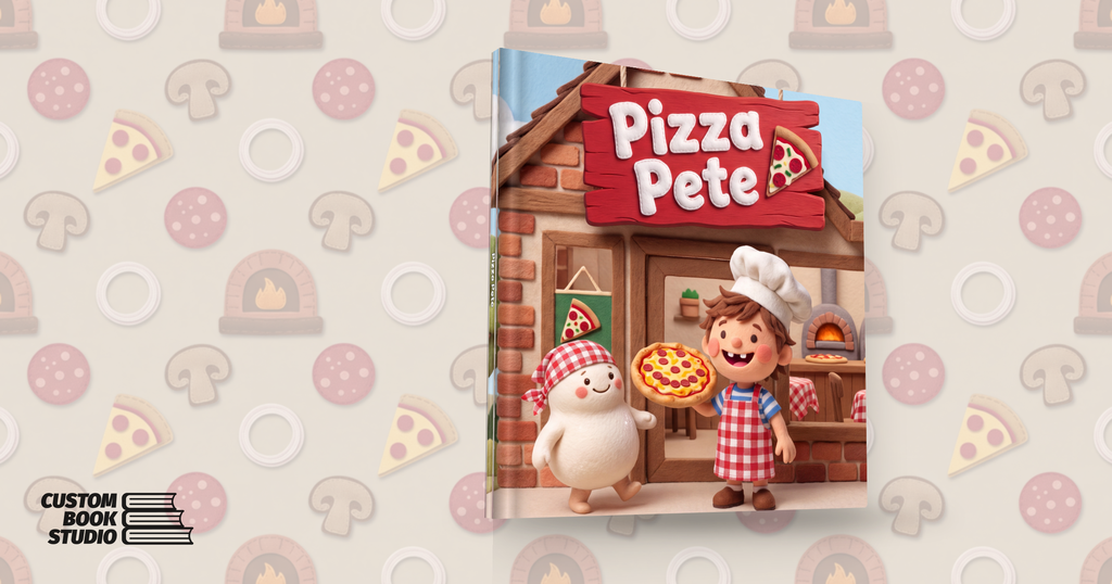
This is the actual book — not a mock-up. Drag to spin it, use the view chips to open the covers, then scroll down inside the panel to read it cover to cover: front board, endpapers and flyleaves, every page, back board.
Pizza Pete is a 32-page hardcover picture book for readers under four: 10 × 10 inches, felt-textured from the dust jacket to the endpapers, about a small boy with a big dream and a ball of living pizza dough called Doughboy. It was written, illustrated, lettered, proofed and made print-ready inside Custom Book Studio, our AI book designer.
This post is two things. It is the story of how the book was made — with the real design prompts our system wrote for each part of it, quoted from the production log. And it is an invitation: Pizza Pete’s first print run is crowdfunding now at $35 a copy.
What the creator actually typed
Every project starts from a brief. This is Pizza Pete’s, in full:
“A boy who loves pizza has a dream to own his own pizzeria some day. His mom and dad encourage him to learn how to make pizza so he can open his own store, and they help him do it and open their own pizzeria called ‘Pizza Pete’.”
That, plus a handful of choices — title, reading age, trim size, binding, and an art style — is the entire creative input. The style here is one an admin built from a single uploaded reference picture; the system studied it and wrote its own description of the look: “the photorealistic aesthetic of a crafted felt object… a clean, limited palette of bright, saturated solid colors… a wholesome, well-lit studio finish.” From that point on, every stage below runs on prompts the system composes for itself. Nothing you will read in this post was hand-written for this book.
Characters come first
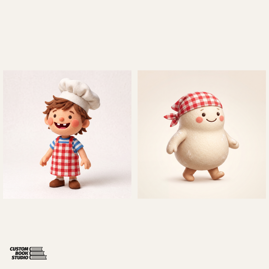
Before a single page is illustrated, the studio invents the cast and pins each member down in a reference sheet. The reference prompt is strict about what a usable reference is:
“Render the character as a SINGLE, clean, full-body illustration in ONE view only… Use a clear, consistent colour palette and markings that an illustrator can copy exactly on every later page.”
Once the sheet is approved it is locked, and every subsequent prompt in the book carries a continuity clause for each character in the scene: “render this character to MATCH THEIR REFERENCE SHEET EXACTLY on every page — identical ethnicity and skin tone, face, hair, body, clothing/outfit and accessories.” That is why Pete’s gap-toothed grin, striped shirt and slightly-too-big chef’s hat survive all 32 pages without drifting.
The story is written to be read aloud
The manuscript is authored by Claude as structured data: for each page, a scene direction for the illustrator, the printed words, and art direction. Reading age shapes the language — under-four means a few warm words per page, built for repetition. Page 2 reads “Pete loves pizza. Warm and round and yummy!” and the last page closes the loop: “Pizza Pete. The best little shop of all!” The full arc — the dream, learning to stir and sprinkle with Mama and Papa, opening day — lands in exactly 32 pages.
Every spread is directed, not just generated
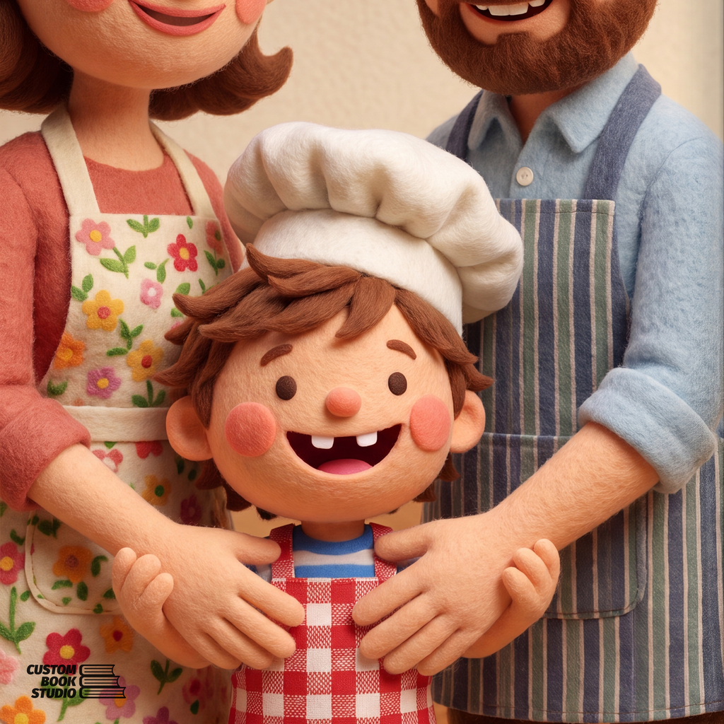
An interior page prompt is a small design document. Three excerpts from page 2’s, as the system wrote it:
“CAMERA: compose this illustration as a medium shot…”
“TEXT SPACE: keep the open wall, upper left of the picture calm, open and low-detail — soft negative space that still belongs to the scene… The story’s printed words will be placed there afterwards.”
“COLOR SCRIPT — this moment’s place in the book’s emotional colour arc: sunny morning gold, soft warm highlights, honeyed cream and toasty crust tones.”
Facing pages paint as one continuous canvas with hard rules about the fold — one unbroken scene, horizon level matched on both sides, and no character or face inside the middle 12% of the width where the binding lives. The printed words are placed afterwards as an editable vector text layer, and a server-side legibility gate makes unreadable colour-on-colour combinations impossible no matter what anyone picks.
A cover is one poster, not three panels
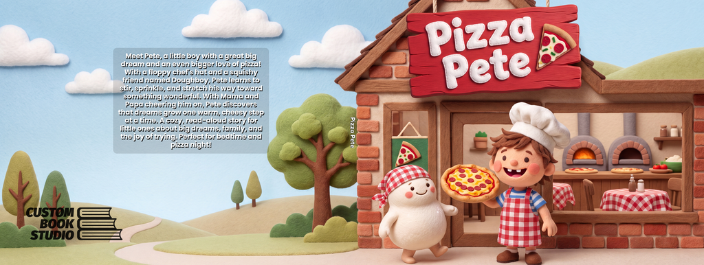
A hardcover jacket has a back panel, a spine and a front panel, but our system never describes them to the image model. It asks for a poster:
“ONE wide, continuous, seamless printed scene that fills the whole poster edge to edge… no vertical line, seam, band, stripe, divider, panel or border anywhere across the width… it must be COMPLETELY WORDLESS, because all text is placed on top afterward.”
We learned that rule the hard way: name the spine to an image model — even to forbid it — and it draws one. The artwork keeps a calm clearing where the title will sit, and the title alone is then AI-lettered in a letterform themed to this story: stitched white felt on a red wooden sign. The author credit, the spine type and the back-cover blurb are ordinary editable typography set by the application, so a typo never costs a render. The printed case under the jacket is the same design, cropped from the same master — the two surfaces cannot drift apart.
Even the endpapers get design rules
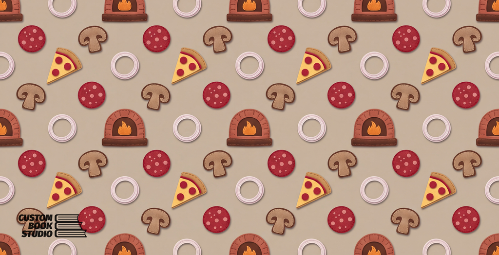
Endpapers render as a proper repeat — the system asks for a “HALF-BRICK (offset / brick-bond) REPEAT… even horizontal rows of identical motifs… like BRICKS in a wall”, with motifs kept small and numerous. On this book the creator then revised the pattern in plain English, and the revision instruction went into the prompt verbatim:
“Change the pattern to be pizza ingredients like cheese pepperoni mushroom and onion, wood burning wood oven.”
A revision is an edit of the existing artwork, not a re-roll — everything the instruction does not mention stays exactly as it was. That is how a three-year-old’s book ends up with wood-fired ovens marching across its endpapers in brick-bond formation.
From files to a bound proof
When the pages are approved, the studio builds the print package: 300-dpi masters with real bleed and safe-area geometry, text rasterized into the printable files, and template composites for the press floor. Then CntrlP, our proofing service, renders the bound object in 3D — the copy you spun at the top of this post — and nothing goes on sale until that proof is approved.
One number worth publishing, because we log every render with its price: the artwork for this entire book — cast sheets, 32 pages, jacket, case and endpapers — took 50 image generations and $5.40 in generation cost.
Back the first printing
Pizza Pete is now a live crowdfunding campaign: $35 a copy, a 15-copy goal, ending August 24, 2026. Back it and you are charged at purchase; if the goal is met the run goes to print, and if it is not, every backer is automatically refunded in full. Either way, every order is reviewed by a human before anything is produced.
Back Pizza Pete here — the listing page has its own preview of the opening pages.
And if a small person in your life has a big dream of their own, the same press that made this book is open: start a book at create.custombookstudio.com, or read about what we print.